Mail: [email protected]
Phone: +1(424)231-4091
Everything you need to know about NexoPOS.
This guide help design your components quickly to ensure seamless integration with NexoPOS 4x dashboard. Those principles have already been set with color and gradients to ease component prototyping.
You can still add TailwindCSS to your module and create your own style. That can be combined with this design principle in case this latest has some limitations for your project.
The variables are the color value we've set for various purposes. Here is a list of components that are colored. The values are set for the Dark Mode. If you create your own theme, those values must be defined on your "_variables.scss" file.
Form:
--input-edge: 30 41 59;
--input-background: 51 65 85;
--input-disabled: 30 41 59;
--input-button: 71 85 105;
--input-button-hover: 59 130 246;
--input-button-active: 59 130 246;
--input-option-hover: 100 116 139;
Box:
--box-background: 51 65 85;
--box-edge: 71 85 105;
--box-elevation-background: 71 85 105;
--box-elevation-edge: 100 116 139;
--box-elevation-hover: 100 116 139;
Crud:
--crud-button-edge: 30 41 59;
--pos-button-edge: 30 41 59;
Numpad:
--numpad-background: 71 85 105;
--numpad-typography: 250 250 250;
--numpad-edge: 71 85 105;
--numpad-hover: 71 85 105;
--numpad-hover-edge: 71 85 105;
Scroll Bar:
--scroll-thumb: 51 65 85;
--scroll-track: 0 0 0;
--scroll-popup-thumb: 71 85 105;
Tabs:
--tab-active: 51 65 85;
--tab-active-border: 30 41 59;
--tab-inactive: 30 41 59;
--tab-table-th: 100 116 139;
--tab-table-th-edge: 100 116 139;
--table-th: 51 65 85;
--table-th-edge: 71 85 105;
Floating Menu:
--option-hover: 100 116 139;
--floating-menu: 71 85 105;
--floating-menu-hover: 100 116 139;
--floating-menu-edge: 51 65 85;
Typography:
--pre: 30 41 59;
--typography: 255 255 255;
--surface: 15 23 42;
--popup-surface: 51 65 85;
--primary: 226 232 240;
--secondary: 203 213 225;
--tertiary: 148 163 184;
--info-primary: 96 165 250;
--info-secondary: 59 130 246;
--info-tertiary: 37 99 235;
--info-light-primary: 191 219 254;
--info-light-secondary: 147 197 253;
--info-light-tertiary: 96 165 250;
--error-primary: 248 113 113;
--error-secondary: 239 68 68;
--error-tertiary: 220 38 38;
--error-light-primary: 254 202 202;
--error-light-secondary: 252 165 165;
--error-light-tertiary: 248 113 113;
--success-primary: 34 197 94;
--success-secondary: 22 163 74;
--success-tertiary: 21 128 61;
--success-light-primary: 187 247 208;
--success-light-secondary: 134 239 172
--success-light-tertiary: 74 222 128;
--warning-primary: 251 146 60;
--warning-secondary: 249 115 22;
--warning-tertiary: 234 88 12;
--warning-light-primary: 255 237 213;
--warning-light-secondary: 254 215 170
--warning-light-tertiary: 253 186 116;
--danger-primary: 202 138 4;
--danger-secondary: 161 98 7;
--danger-tertiary: 133 77 14;
--danger-light-primary: 254 249 195;
--danger-light-secondary: 254 240 138;
--danger-light-tertiary: 253 224 71;
--default-primary: 203 213 225;
--default-secondary: 148 163 184;
--default-tertiary: 100 116 139;
--default-light-primary: 226 232 240;
--default-light-secondary: 203 213 225
--default-light-tertiary: 148 163 184;
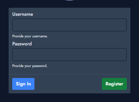
A box is used to create a squared section where controls or text and be used. That feature is mostly used for the login and registration form. It's also used to create a popup.
A box uses "ns-box" as a parent class. If your box has a title, a body, and a footer, you'll use the following class to style those areas:
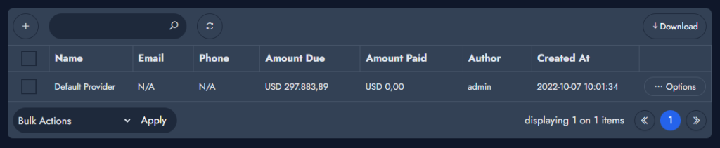
The crud table is a component that lists entries. It's widely used on NexoPOS for showing sales, customers, providers, products, and much more.
A crud table has various sub-components that use their own design principles. The following principles only apply to the table itself.
At the moment, we believe only one crud component is displayed per page. Therefore, it has the id "crud-table", if the crud table has an input on the header, you'll apply the class "ns-crud-input" to it. Each row must have the class "ns-table-row". If a row has an options menu, that menu should be wrapped with a div that has the class "ns-menu-wrapper" and the action button should have "ns-action-button" class.